Its ubiquity renders it near invisible; the friendly characters unnoticeable until you notice them.
Then, they’re everywhere.
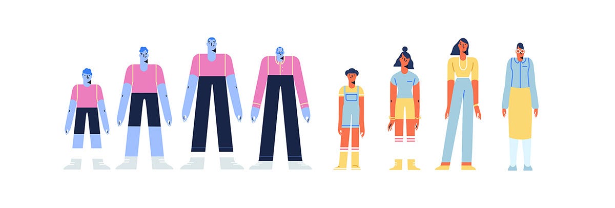
With surreal skin tones and disproportionate limbs, they go about their merry little lives of walking through parks or playing the ukulele.
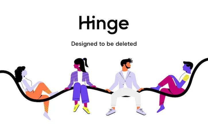
You’ve no doubt met before, but allow me to introduce you to Corporate Memphis. A style of flat design illustration with aggressively optimistic figures and a less than cheerful background.
So, how did the style come to consume the visual world and court criticism from the design industry?
HOW IT CAME TO BE
Corporate Memphis itself is a pejorative term, poking fun at the way an original design style has been ruthlessly commoditised by the tech corporates of silicon valley.
Trends don’t emerge from voids and it was Apple’s zag away from skeuomorphism in 2013, which catalysed the shift towards flat design in computer interfaces. The tech behemoth ditching the ‘real life’ aesthetic supposedly loved by Steve Jobs for flatter, more user-friendly forms.
It was only a matter of time till the flat approach came for figures, and thus Corporate Memphis as we know was born.
Although, as with many things, the style’s true origin is unknown. Some trace the beginning back to 40 illustrations created for Slack by independent designer Alice Lee.
Others credit the design firm BUCK who used similar figures in their illustration and animation guide ‘Alegria’ for Facebook in 2017. Like lemmings, the rest of Silicon Valley quickly followed suit, and Corporate Memphis went global.
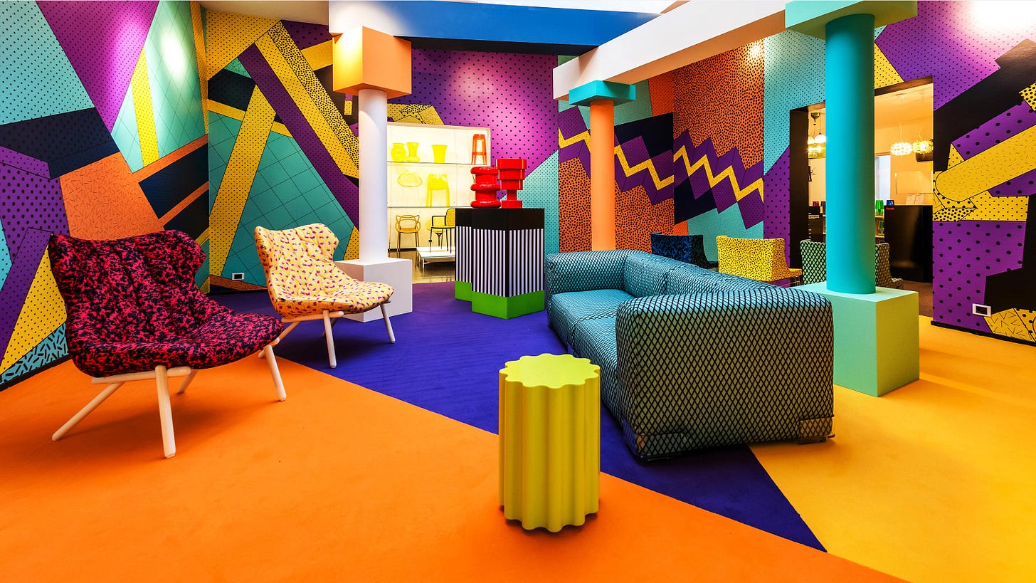
Regardless of who gets the credit, the style’s name is an undeniable nod to the source of inspiration; a 1980’s Italian design and architecture firm named ‘The Memphis Group.’ Post-modernist to the core, the group used bold colours and warped shapes to bring a sense of ridiculousness to what had previously been a very sensible approach to interior design.
WHY IT'S POPULAR
Within the hundreds of historical and socio-political factors, there are two fundamental reasons Memphis was primed to go from an 80’s furniture fad to the style of choice for big tech.
It’s unrealistic yet humanistic.
Unworldly colours, distorted shapes and deceptive lines were the bread and butter of Memphis design, which doesn’t seem that remarkable until one applies these visual principles to people.
The result; figures that are realistic enough to be relatable, but abstract enough to be relatable to far more people than a life-like illustration or photo. If a dancing figure on a homepage has lilac skin, they don’t align to any race, arguably then resonating with every race.
It’s replicable.
How do you produce more work for less money? That’s the question haunting the design industry today and one Memphis’ cookie cutter shapes and colours can answer. Free from any distinct features or artistic flair, the flat monochromatic style is easily standardised and reproduced at scale in a way that is both consistent and cost-effective.
Diverse, funky and financially efficient, Corporate Memphis seems like a harmless, if not rewarding bandwagon to jump on.
However, upon closer inspection, some have found that the very advantages enabling mass proliferation have a dark side.
It’s replicable.
Within the design industry, one of the main critiques is that Corporate Memphis is so mild and unremarkable, it is soulless.
Sure, it’s a technical critique, but one we non-designers can see for ourselves. In the world of Corporate Memphis, there are no sharp edges or gritty textures, no humanity. Instead, just jovial vignettes made of pastel curves that can be copy-pasted into eternity.
The obvious counterargument to this is, does user interface design really need soul?
Corporate Memphis may be the design equivalent of royalty-free stock images, but we often aren’t navigating through these websites in search of artistic revelation. We just want information, ideally, in an aesthetically pleasant and efficient way.
Whether the result (an internet where everything looks the same, based on a style that circumvents paying designers better or encouraging innovation), remains to be an issue, is up to you.
It’s unrealistic yet humanistic
At first glance, the candy-coloured skin and spiralling limbs look like a step towards diversity and inclusivity. No one is represented, so everyone is represented, as the logic could go.
But what if no one is represented, so no one is represented?
What if the comically alien features of Corporate Memphis isn’t about moving towards diversity, but circumventing criticism by refusing to engage in it altogether?
You can’t accuse someone of not representing you if they haven’t represented anyone.
THE ISSUE
You may wonder (like my partner did after I passionately ranted about the above) why this is a ‘big deal’.
“Corporations are always going to try to achieve maximum appeal for minimal accountability,” he said. “I don’t understand why that’s noteworthy”.
Cynical but true. It seems almost too obvious to point out. Yet I still think it’s worth doing because the issue isn’t really about Corporate Memphis at all.
Rather, in the words of tech writer Claire L. Evans, it’s about how the style “makes big tech companies look friendly, approachable, and concerned with human-level interaction and community – which is largely the opposite of what they really are.”
Again, it’s easy to dismiss this as ‘just design’. They’re just figures, used by the internet. And this is true. But I’m also unwilling to believe that a USD$ 1 Trillion company like Facebook uses certain styles simply because they look nice.
So, that’s what I’ve been thinking (and seeing, everywhere, like a little black dog of design).
As always, thanks for subscribing, and if you like what you see, click the button below to share the love with your mates.
Sarah.


It propagates the same way React does--inexperienced fad chasers who've never used anything else collectively decide it's the best thing in the world and prove themselves right by continuing to never use anything else.